 Instagram
  Youtube
  Whatsapp
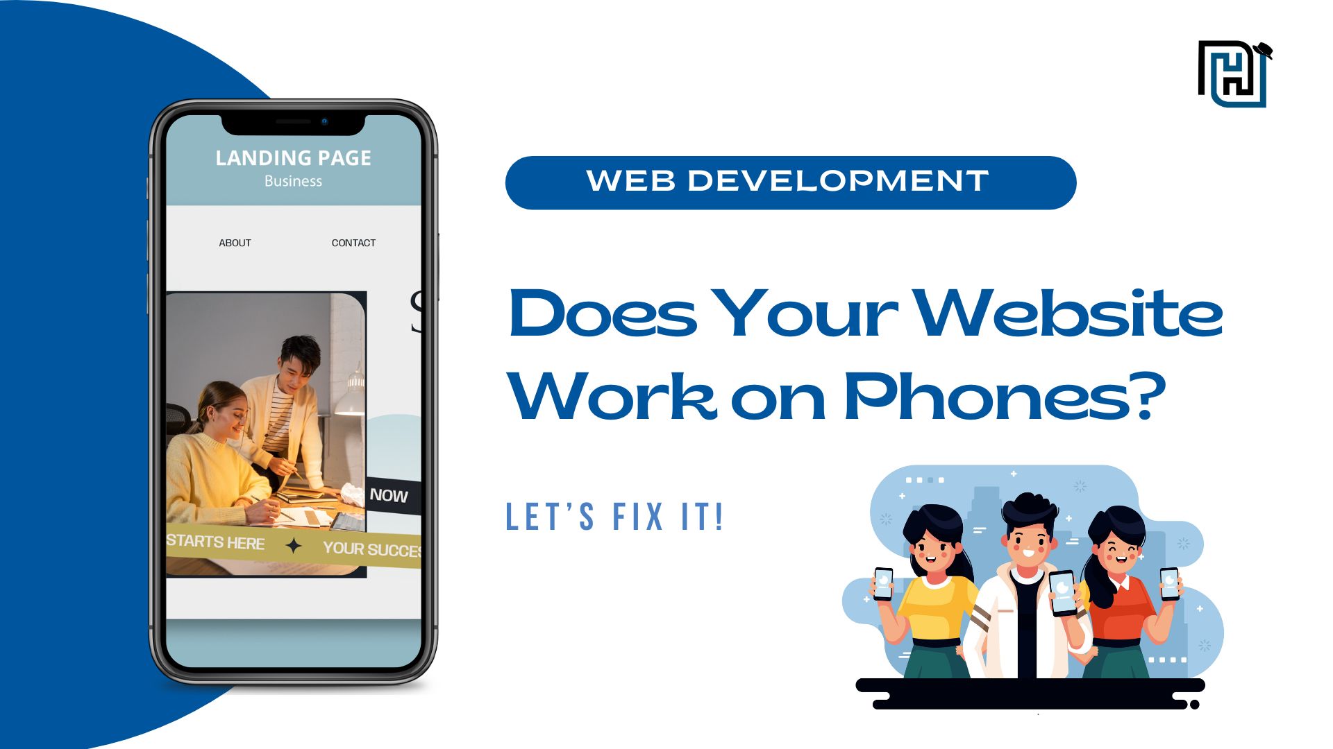
 How to Check if Your Website is Mobile-Friendly: A Guide for Everyone
Today, most people use their phones to go online. If your website doesn't work well on phones, you're missing out. It's not just about looking good; it's about making it easy for people to find you and use your site. Google also likes websites that work on phones, so it helps your website show up higher in search results. This guide will show you how to check if your website is good for phones, from simple tests to more advanced things developers can do.
Need help with website redesign for better efficiency and higher conversions? Connect with the Devex Hub team—we'll create a fully optimized, mobile-friendly website that delivers results.
Basic Mobile-Friendliness Checks
[1]. Google's Mobile-Friendly Test:
- Google has a free tool that checks your website. Just type in your website address, and it will tell you if it's mobile-friendly.
- It will show you if the text is too small, if buttons are too close together, or if there are other problems.
- If you see errors, it means you need to fix those things to make your website better for phones.
[2]. Google Search Console:
- If you have a Google Search Console account, you can see more details about how Google sees your website on phones.
- It shows you if there are any problems that stop Google from showing your website properly.
- Navigate to "Mobile Usability" under "Experience." Review error messages and follow Google’s suggestions to fix them.
- This tool helps you find and fix problems that might hurt your website's search ranking.
[3]. Manual Testing on Real Devices: The best way to see if your website works on phones is to use a phone. Try it on different phones and different browsers (like Chrome or Safari).
Key areas to check:
- Navigation (Menus should be easy to tap.)
- Readability (Text should be clear without zooming.)
- Interactive elements (Buttons should be large enough to tap easily.)
[4]. Responsive Design Checkers: There are websites that let you see how your website looks on different phone screens. Tools like Responsinator and Screenfly let you preview how your website appears on different screen sizes.
Core Elements of a Mobile-Friendly Website
[1]. Responsive Design: A well-designed website adapts to different screen sizes, ensuring it looks and works great on phones, tablets, and computers. CSS frameworks like Bootstrap and Tailwind CSS make this easier by automatically adjusting the layout for various devices.
[2]. Fast Loading Speed: Speed matters for mobile users. Optimize loading time by:
- Using a fast web hosting service.
- Enabling browser caching.
- Minimizing redirects.
[3]. Easy Navigation: Make it easy for people to find what they're looking for. Use clear menus and buttons that are easy to tap with a finger.
[4]. Readable Text: Ensure the text is large enough (at least 16px) and contrasts well with the background. Make sure there's enough space between lines of text.
Advanced Performance Optimization for Developers
[1]. Image Optimization:
- Use new image formats like WebP, which make pictures smaller without losing quality.
- Use lazy loading, so pictures only load when they're about to show on the screen.
[2]. Code Optimization:
- Make your website's code smaller and simpler. Only load the parts of your code that are needed.
- Prioritize the most important code to load first.
- Minify CSS, JavaScript, and HTML.
- Remove unused CSS and JavaScript.
- Use code-splitting to load essential scripts first.
[3]. Network Performance:
- Switch to HTTP/2 or HTTP/3 to help your website load faster and perform better.
- Use Content Delivery Network (CDN), which stores parts of your website on servers around the world.
- Reduce the number of times your website has to ask for files.
[4]. Core Web Vitals:
These are things Google uses to measure how fast and good your website is.
- Largest Contentful Paint (LCP): How fast the biggest thing on your website shows up.
- First Input Delay (FID): How long it takes for your website to react when someone taps a button.
- Cumulative Layout Shift (CLS): How much things move around on your website while it's loading.
To improve these scores:
- Improve load speed.
- Ensure fast response to user interactions.
- Avoid sudden shifts in page layout.
Enhancing User Experience (UX) on Mobile
[1]. Touch Interactions:
- Make sure the buttons are big enough to tap.
- Use gestures like swiping.
- Give people feedback when they tap something.
[2]. Accessibility:
- Follow WCAG guidelines for color contrast, keyboard navigation, and ARIA attributes.
- Make your website easy to use for everyone, including people with disabilities.
- Use special code to help screen readers.
[3]. Progressive Web Apps (PWAs): PWAs improve mobile experience with offline functionality, faster load times, and app-like behavior.
[4]. Motion Design and Microinteractions: Use small animations to make your website more interesting. Give users feedback when they do something.
Advanced Responsive Design Techniques
- CSS Grid and Flexbox: These are tools that help you make layouts that change easily.
- Media Queries: These let you change how your website looks based on the screen size.
- Viewport Meta Tag: Ensure proper scaling with <meta name="viewport" content="width=device-width, initial-scale=1">.This tells phones how to show your website.
Testing and Debugging for Mobile
- Real Device Testing: Always test your website on real phones.
- Network Throttling: Test your site under slow network conditions using Chrome DevTools.
- Remote Debugging: Debug mobile issues using Chrome DevTools’ remote debugging feature.
- Automated Testing: Use frameworks like Lighthouse, Selenium, or Cypress to automate tests.
- Continuous Monitoring and Optimization: Regularly check performance using Google PageSpeed Insights and WebPageTest.
Conclusion
Making your website mobile-friendly is very important. Use the tools and tips in this guide to make sure your website works well on phones. Keep checking and making improvements. The way people use the internet is always changing, so keep learning and adapting. If you’re looking for expert guidance, the web development team at Devex Hub is here to help you build a fast, user-friendly website that drives results.


Comments
Post a Comment